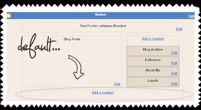
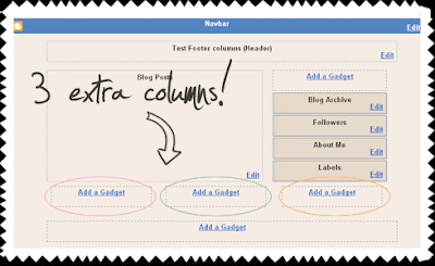
 We can do better. Let's start with adding 3 columns in the footer, and place the default one on the bottom.
Advantages:
► you can place more widgets (gadgets)
► rearrange them as you want
► your main content area will load faster if you place your "biggest" widgets on the bottom
Ok, let's do this. This time, you'll just have to Copy-Paste. It's a 7 min job. Before you begin, do back up your template (1 minute).
1. If you already have some widgets (gadgets) in the Footer, remove them:
LAYOUT ► check if you have gadgets in the footer ► if you do, click on Edit and ► Remove
or, just "drag" them in the Sidebar. You'll get them back in place when you integrate the Footer columns.
2. Go to LAYOUT ► EDIT HTML ► and locate the following part of the code:
..ABOVE it, you'll have to place the following part of the code:]]>
...that's the CSS style for our new Footer section. We'll talk about customization (colors, borders, backgrounds, headings...) in the other tutorial.#footer-columns {
border-top:1px dotted #999999;
clear:both;
margin:0 auto;
}
.column1 {
padding: 0px 5px 3px 5px;
width: 30%;
float: left;
margin:3px;
text-align: left;
}
.column2 {
padding: 0px 5px 3px 5px;
width: 31%;
float: left;
margin:3px 3px 3px 5px;
text-align: left;
}
.column3 {
padding: 0px 5px 3px 5px;
width: 30%;
float: right;
margin:3px;
text-align: left;
}
.addwidget {
padding: 0 0 0 0;
}
#footer-columns ul {
list-style:none;
margin:0 0 0;
padding:0 0 0;
}
#footer-columns li {
margin:0;
padding-top:0;
padding-left:0;
padding-bottom:.25em;
padding-right:15px;
text-indent:-15px;
line-height:1.5em;
}
body#layout #footer-columns {
width: 100%;
margin-left: auto;
margin-right: auto;
}
body#layout .column1 {
width: 32%;
float: left;
}
body#layout .column2 {
width: 32%;
float: left;
}
body#layout .column3 {
width: 32%;
float: right;
}
3. Now, to add some containers. In your LAYOUT ► EDIT HTML ► locate this part:
...Save template....you will DELETE it, and REPLACE with this code:
Basically, that's it. It works for the templates with different width, because the columns are fluid (made to stretch to fit the footer-container width).
Some margin adjustments may be necessary for the wider templates.

0 التعليقات: